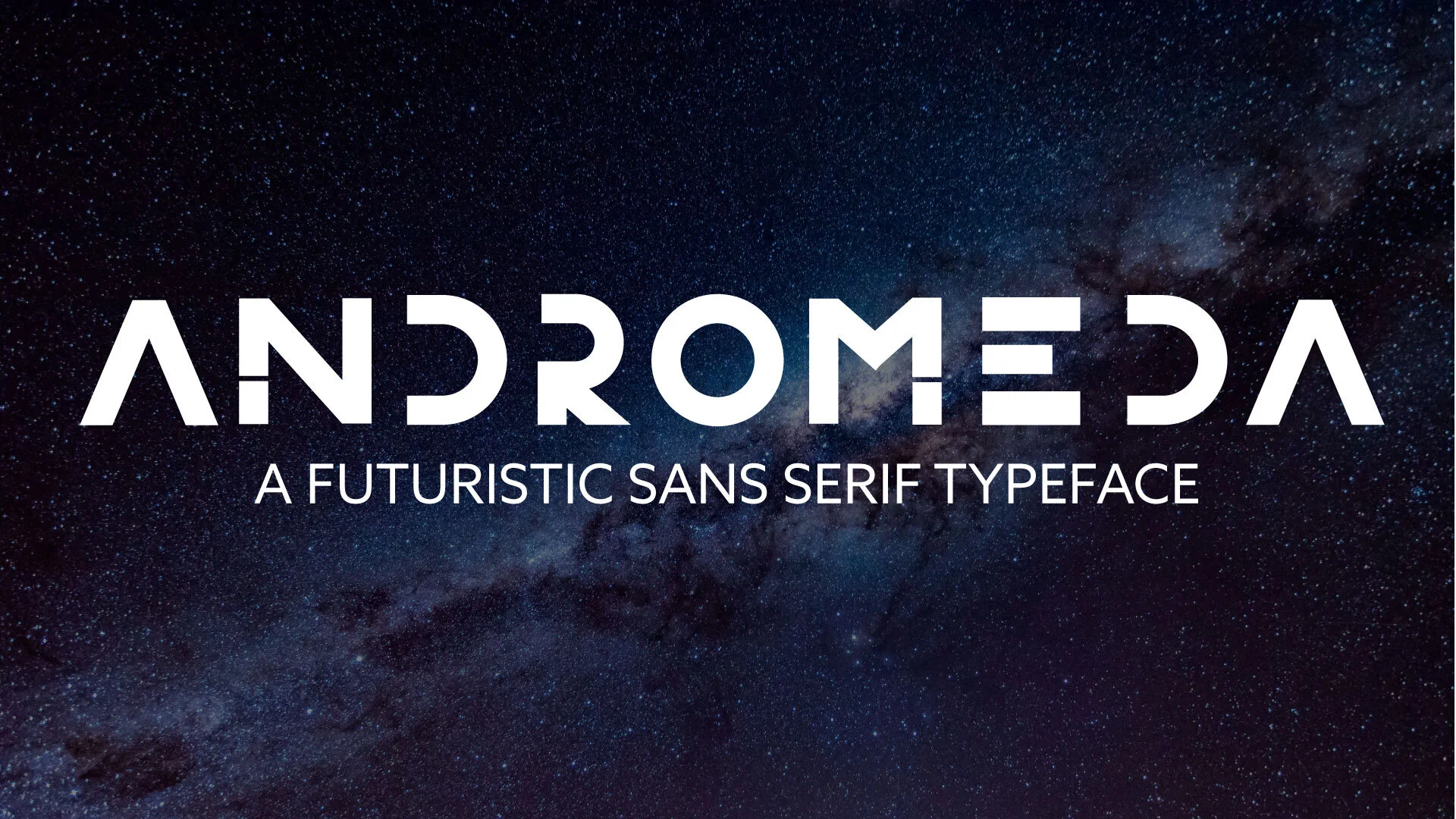


As part of my typography class in semester 6 at Humber College, I was challenged to design and execute my own typeface from start to finish. I knew I wanted to create a modern, simplified typeface that would reflect me as a person and as a designer.
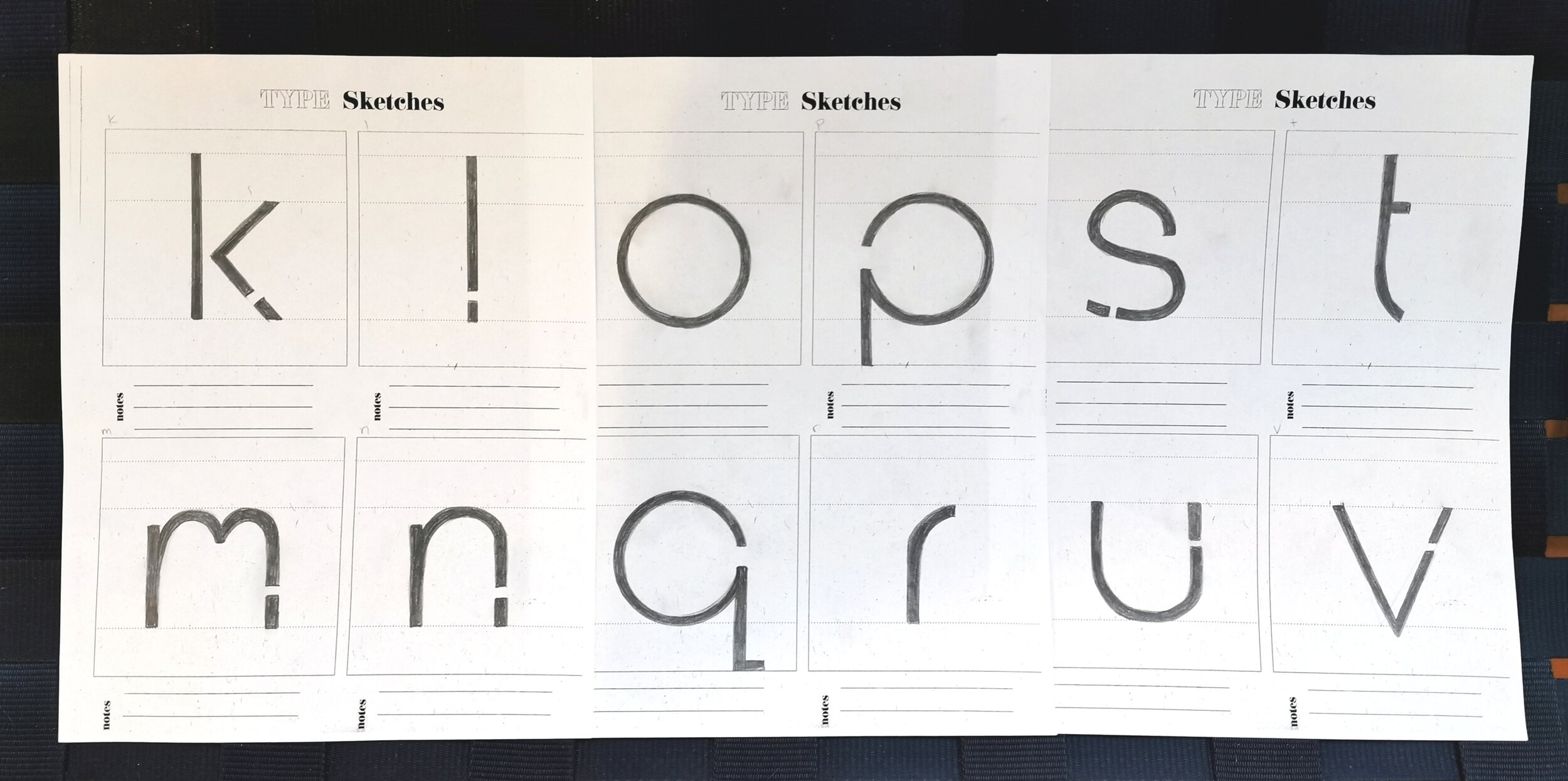
I began with very rough sketches in my notebook before creating these final sketches. The process was long and I tried to be as precise as possible so that digitizing the typeface in Adobe Illustrator would be easier. As I began my final sketches, Andromeda started to come to life. Originally I planned for the strokes to be very thin, but this changed later during the digital process.
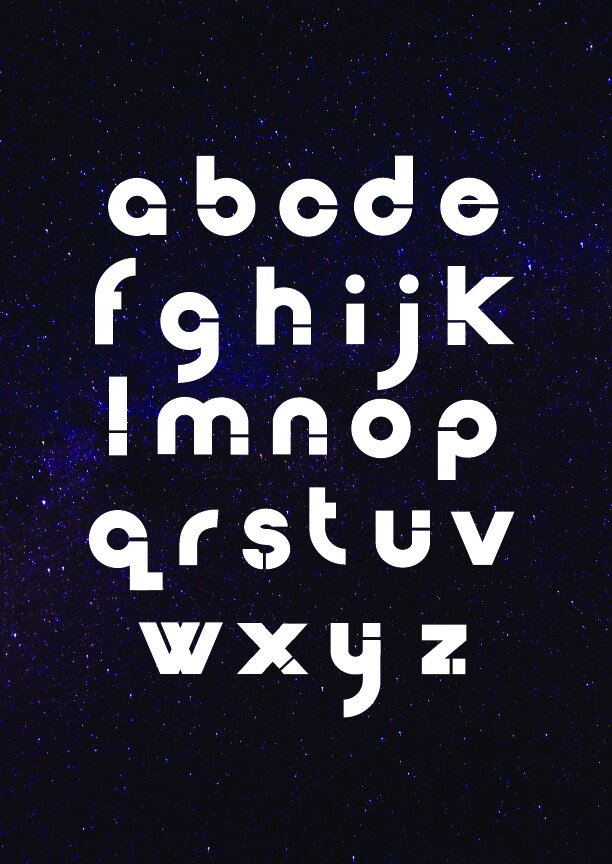
After the sketches were complete, I scanned them into Adobe Illustrator and began the digital process of tracing my sketches. During this time the weight of my typeface changed because I decided a bolder appearance was more fitting for the personality of my typeface.
The individual characters are designed to include cut outs, and some characters are intentionally missing stems or cross bars. This is because I wanted to design a typeface that feels complete without being entirely complete.
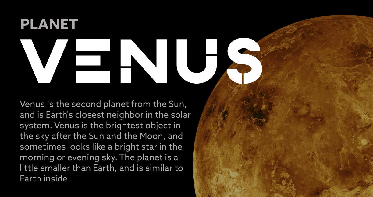
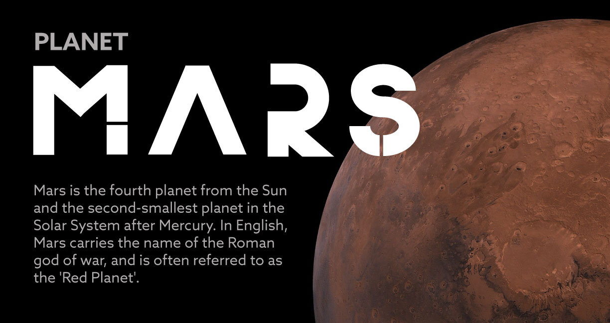
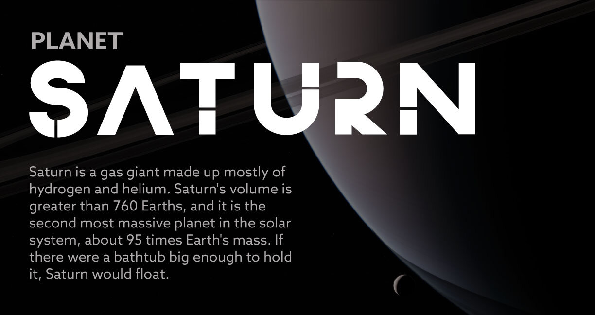
Once I had completed the digitization process for Andromeda, I wanted to show it off in it’s best light. Because of it’s simplified letterforms, Andromeda can not be used for body copy and should instead be used for headings. I chose to create informative posters for each of the planets in our solar system because Andromeda’s futuristic appearance complements the theme of space exploration well.